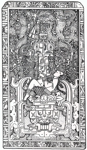
All this time, I thought he was "Pascal". With an "S", not Pacal. I was wrong.I
 named this painting after the Mayan emperor
Pacal whose tomb inscription read to me like layers in my artwork. Turns out, somewhere along the line, I dropped in an "S".
When Eric and Andy got the painting "Pascal" they asked if I would send them a little something about the piece; an artist's interpretation, or comment on the work.
Now that they have returned from a year trip around the world, and are about to have a baby, ahem.... yes it has been years, I thought it might be time to finally deliver the goods.
The first thing to report is that the painting was meant to be called
Pacal. Now that it's been years, I suppose the purple figure with his arms outstretched (who's namesake is the painting) will continue to be called "Pascal", as will the painting:
************
The Painting Pascal******************
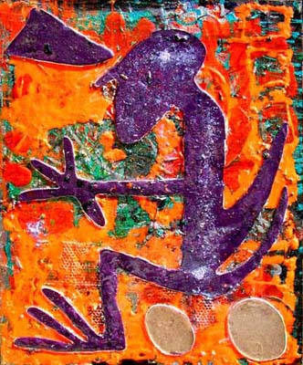
The painting
Pascal was one of the first I did using the concept of pouring plastic resins, most commonly used for making sculpture, onto canvases into shapes outlined by caulking. The technique of using caulking to shape an image in plastic on canvas, to my knowledge, is still original.
The first layers of
Pascal were lots of my own glyphs done in pen. Each layer of the painting is building up to the creation of Pascal, the figure. Each layer of abstraction is "striving for identity of self" as we all are when we are in the process of attaining consciousness.
Pascal is on a journey; a journey into new worlds of the unexpected where he will encounter new beings and new experiences. Some will challenge him and he will grow, others will validate his passion for his existence.
In the painting, his full sense of intuition, seems to extend out like a cone from his third eye. His intuitive center is clear and beaming. That lighter shade of purple inside his head that looks like a reflection is made of pearlescent pigment powder that I sprinkled onto the plastic resin as it was drying. The pearlescent powder extends down his spinal column. At his root chakra, again we find clarity and light.
The figure's arms are outstretched, almost as if he is using his hands to control his direction. With eyes wide open to experience, and with a firm sense of being held by fate, Pascal has his hands on the controls of his choices. He is going to other worlds, other paradigms of existence where his intuition, root and power of choice will guide him.
My intention with this painting was to represent and honor the
Mayan Emperor Pacal's powerful disposition towards his actively changing reality.
******************
And now that it's been years and Eric and Andy have returned and are embarking on a new journey. Transformation abounds.
Blessings to new life.